CEM Member Experience Series
Learn how leading global pension plans
create great member experiences
Public Websites
Part 3: Self-Service Support
The focus of this third issue in the CEM Member Experience Series is on self-service support. Members should be able to find the information they want on the public website without resorting to tools like search, FAQs, chat or having to contact the system. This report looks at best and poor practices for supporting members once the website's navigation fails.
First, a reminder of why the public website is important:
Self-service support is the final part of our research on public websites.
1. Visual, structural and textual clarity
2. Life events
3. Self-service support
The more questions a member can answer themselves, the better. A robust and intuitive search function is one way to achieve this.
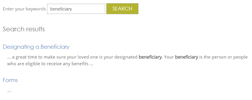
Best practice: On content-heavy websites, site visitors may be inclined to immediately look for a search box. There should be one on your homepage. When the first results from a search give relevant information, and then a form the member can use, they may have found everything they need.
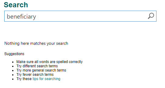
A member won't be able to help themselves if the search function isn't engaging.
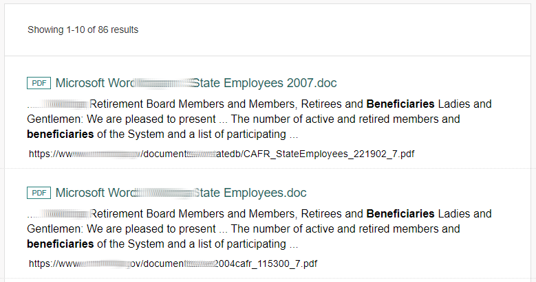
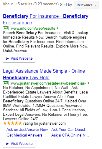
Practice to avoid: Ensure key words associated with pensions have relevant information. Search results shouldn't pull results from another government branch or Google.
If search results aren't helpful, provide alternative ways to get answers.
Best practice: Good plans do their best to answer a member's question, even if human support is required.
Sell the secure website if it will help answer the member's question.
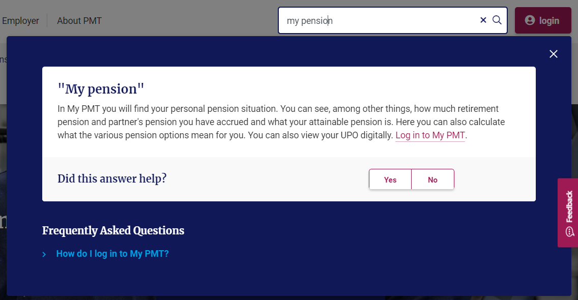
Best practice: PMT encourages members to learn more about their personal pension situation with direct links to the secure member area in their search results. A link to a logical member follow-up question, "How do I log in?" is included as well.
Making a phone call is still a preferred option for many members.
Idea: KPERS and SHEPP give members the option to make a phone call or send an email at the top of their website. There isn't even a need to click on a contact menu.
Once self-service options haven't helped, how easily can a member find the contact menu?
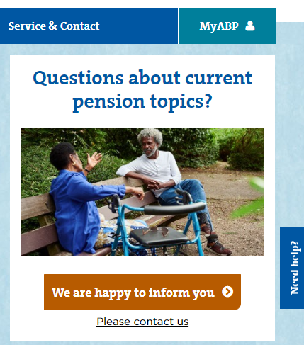
Best practice: The contact menu is visible on every webpage. ABP has a clear link in the top navigation menu, website body, footer and a floating 'Need help?' button. Wherever the member is on the homepage, if they need support they will find it easily.
It is frustrating when the contact menu is hard to find, taking more time and effort than needed.
Practice to avoid: Burying the contact menu feature in a dropdown menu or at the very bottom of the page is frustrating. The example below also features social media links that are more prominent and could encourage your member to leave the site altogether.
After selecting the contact menu, provide a simple menu of contact options.
Best practice: Have multiple options for members to access live support, including a phone number, e-mail, live-chat, 1-on-1 counselling, online forms, even a mailing address.
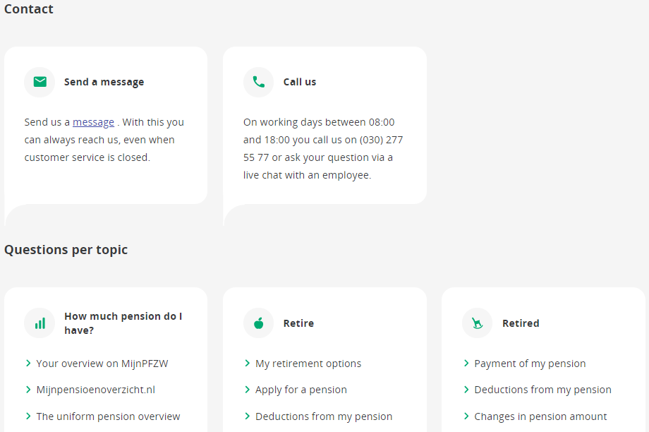
Some plans choose to include FAQs on their contact landing page in a last ditch attempt to encourage self-service.
Idea: FAQs may be helpful for the member who doesn't bother to navigate your website, and goes directly to your contact menu. FAQs will be irritating for the member who has put in the work, but just wants to find a phone number or email. Lead with contact information at the top of the webpage. Provide FAQs as a secondary option.
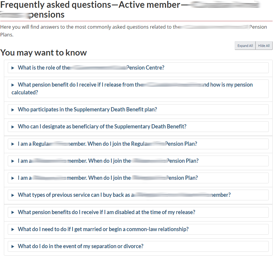
If FAQs are unorganized, members will be unlikely to find the answer to their question.
Practice to avoid: FAQs should be a secondary option and sorted with the most relevant questions at the top so members aren't forced to scroll down any great length. It is best to organize questions by life events.
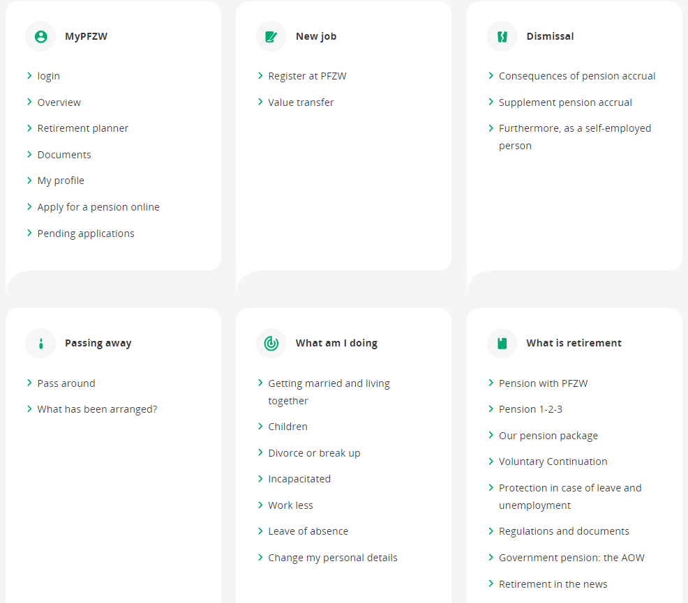
PFZW broadly organizes their FAQs by life events.
Best practice: Life events are also an intuitive and accessible way to organize FAQs.
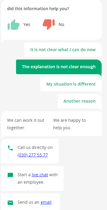
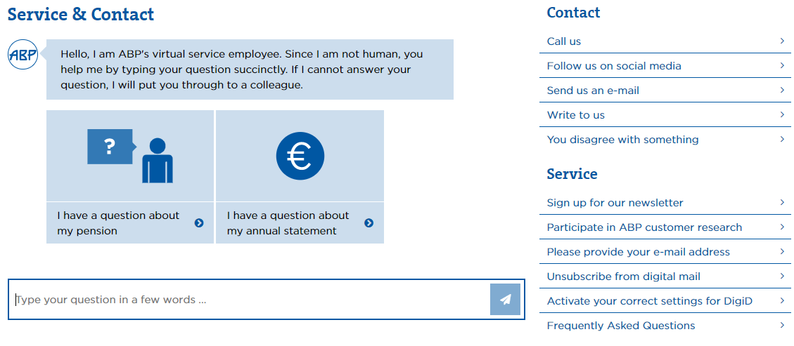
ABP introduced a virtual assistant on their contact page.
Idea: Virtual assistants offer streamlined and efficient customer service. They are available 24/7, offering instant and real-time solutions to simple problems. But when they are unable to assist, moving the member to a platform for human help is key. Your virtual assistants need to demonstrate great results before you go live with them, or they will likely frustrate members.
There should be a quick way for your members to reach you, even if there is only one option.
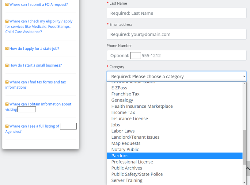
Practice to avoid: Requiring multiple fields to be completed in order to ask a question takes too long and is discouraging. This government website provides one option and doesn't have a category for 'Pensions' to point the member in the right direction.
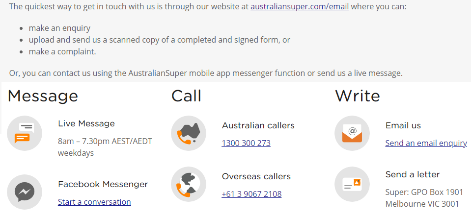
If a member decides they prefer to use the phone, it's best if there is only one number.
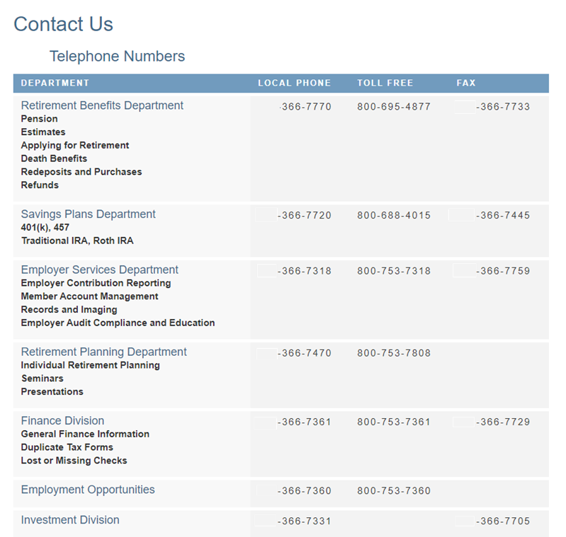
Practice to avoid: We're all used to multiple options to select from in an automated phone tree. Listing too many numbers as an alternative on the contact page isn't more clear or easier to navigate.
Sending an email allows members to choose their own timeframe, attach files, and retain a back-up of the correspondence.
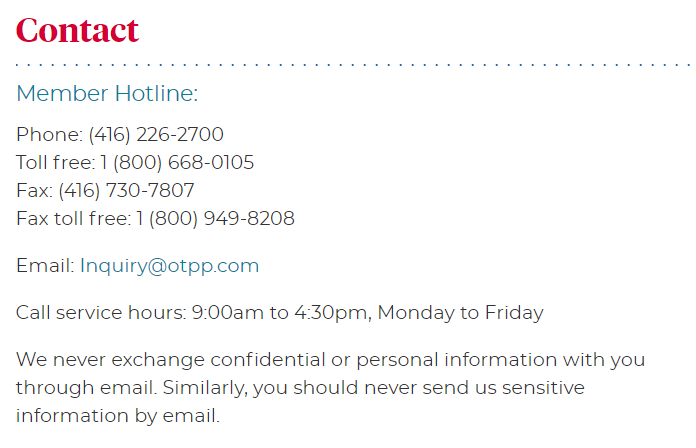
Best practice: A straightforward email link that opens up a new message window is very convenient. It is important, however, to remind members not to send confidential information through that medium.
Email volumes per active member and annuitant have increased by 5% per year in the last 6 years.
For CEM clients with 7 years of data, incoming emails per 1,000 active members and annuitants have increased from 40 in 2013 to 52 in 2019.
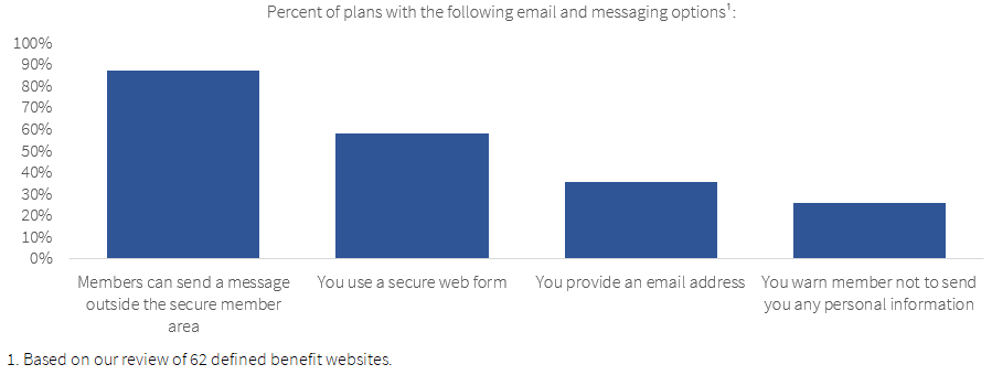
Only 35% of plans provide members with an email address on their public website. A key reason why is email security. 58% of plans use a web form for messages. Less than half of these plans indicate the form is for general enquiries only, and warn members not to share any personal information.
Many plans opt for secure mailboxes.
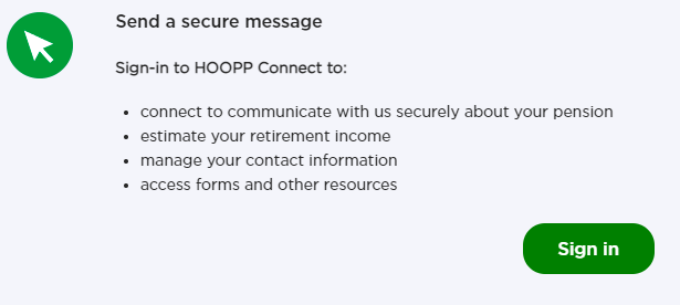
Plans commonly redirect members to the secure member area to send messages, as shown in the example below.
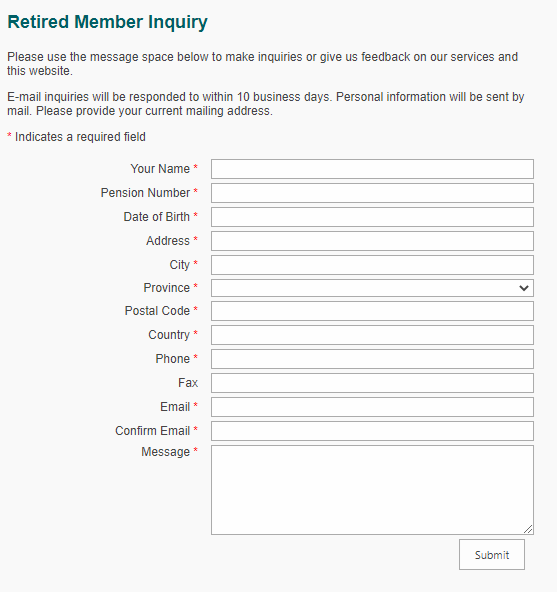
Email forms with too many fields to complete are frustrating.
Practice to avoid: This is an inordinate number of required fields for a member who just wants to ask a question.
Some plans have introduced live chat as an alternative to more traditional messaging channels, like email.
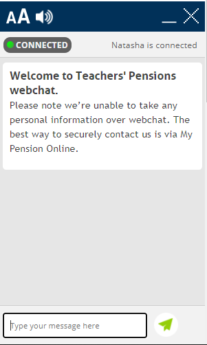
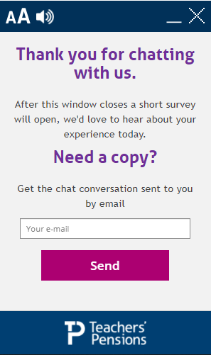
Idea: TPS has a floating button on their website which allows the member to initiate a chat anywhere. Once established, expectation management is achieved with a queue and a reminder that personal information should not be shared. After the chat there is the option to receive a copy of the discussion, and an opportunity to provide feedback. A few plans report promising early results: live chat is the channel with the highest member satisfaction scores.
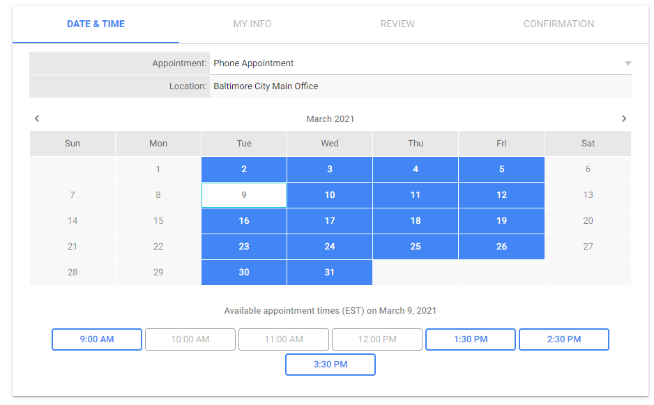
If you have a high-touch delivery approach that encourages 1-on-1 counseling, make it easy to book a counseling session.
Best practice: In the example below, once the member chooses a date and time, and enters some basic information, the meeting with a specialist is confirmed.
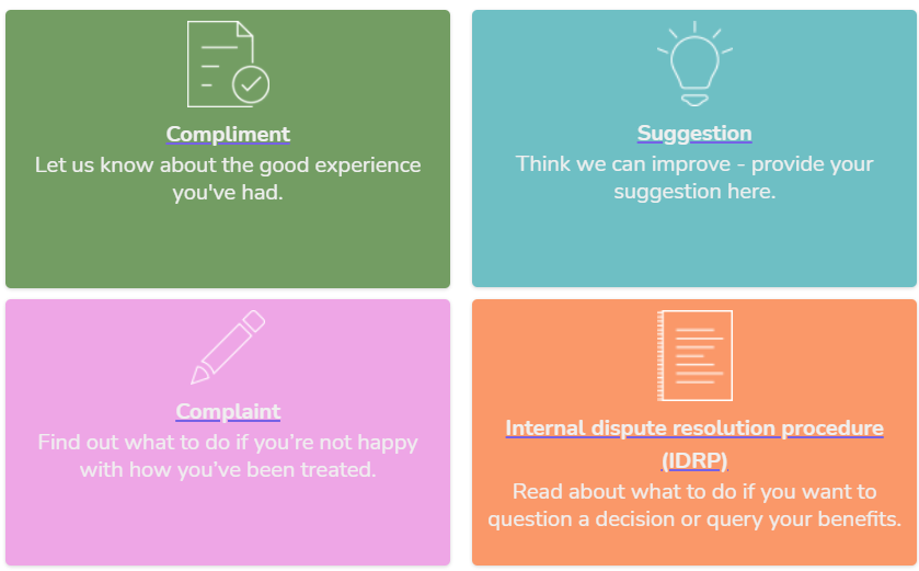
Although formal complaints cause work, it is important to make the process transparent for your members.
Idea: Dutch and British plans are the most transparent about formal complaint procedures. It is in the best interest of the member to make this process easy and clear.
Eight ways to improve the transition from self-service to human support.
Members may be inclined to search your website right away, rather than navigate your website menus. Ensure your search function is visible on your homepage and results are intuitive.
Ask your members if the search results were helpful. If not, provide them with alternative ways to get an answer.
Phone calls are still the preferred contact method. One central number at the top of your website is easiest for the member to find.
Make the contact menu easy to find in your navigation menus, and the body and footer of your website.
Provide multiple contact options, so the members can choose their preferred contact method.
Email remains popular. Many plans now use web forms. If emails or web forms aren't secure, tell the member not share personal information.
Keep your frequently asked questions up to date and relevant. Organize questions by life event.
Ensure complaint and appeals procedures are transparent.
How to access the rest of CEM’s public website review?
The rest of our public website review can be accessed via the links below:
Do you have a specific question for your peers? Join the discussion on CEM's Peer Intelligence Network (PIN).
Copyright 2021 © CEM Benchmarking Inc. All Rights Reserved


