CEM Member Experience Series
Learn how leading global pension plans
create great member experiences
Public Websites
Part 1: Visual, Textual and Structural Clarity
The focus of this first issue in the CEM Member Experience Series is on best practices for visual and structural clarity of your public website.
Your public website is important, because:
Visual, structural and textual clarity is part 1 of our research on public websites.
1. Visual, structural and textual clarity
2. Life events
3. Self-service support
Identify a member-centric goal and starting point for your website. Don't overcomplicate the goal.
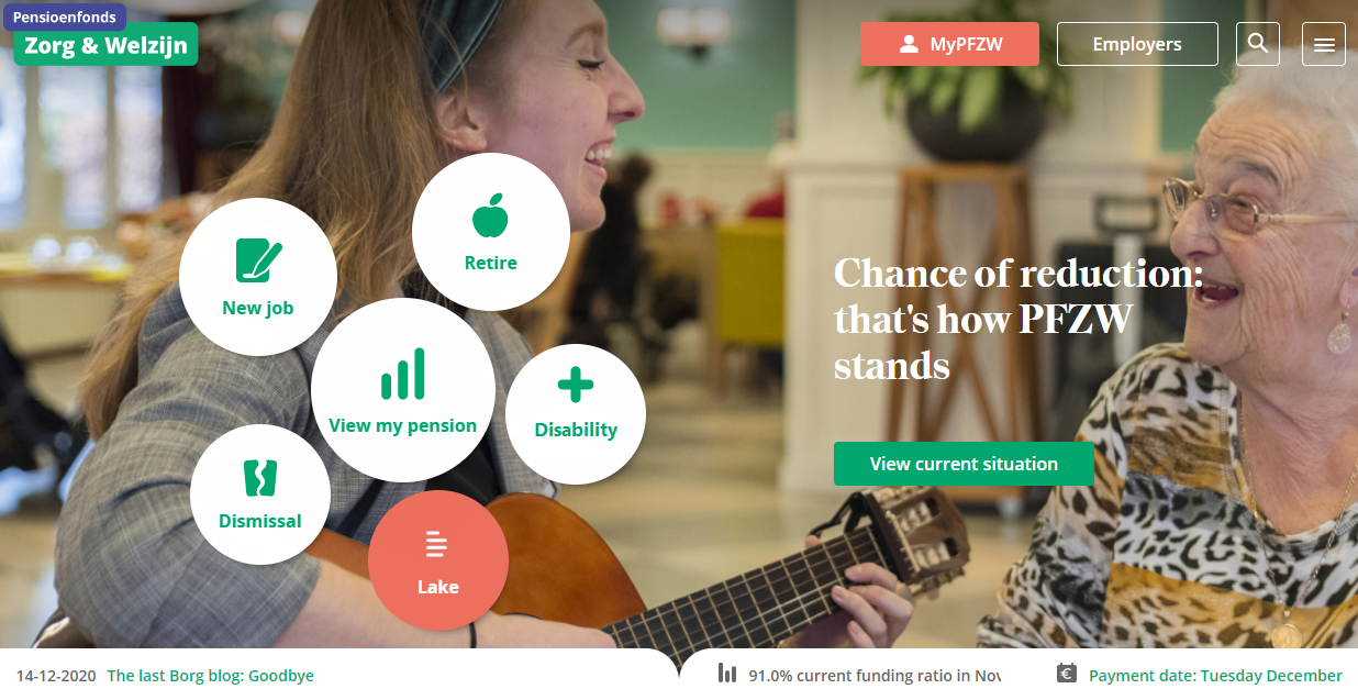
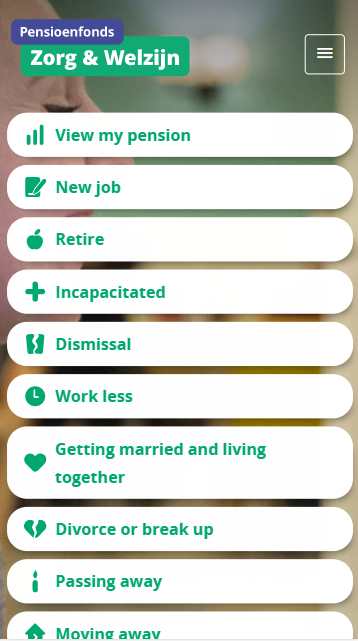
Best practice: The best websites organize information in a simple and intuitive way. Life events are a great member-friendly starting point for your website.
If your website doesn’t have a clear starting point you risk confusing and frustrating your members.
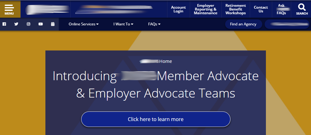
Practice to avoid: Too many, hidden or poorly organized navigation options confuse and frustrate members. The primary menu below is hidden in a dropdown menu that opens if you click on the gold 'Menu' button.
Sell your members on the benefits of the secure member area with every chance you get.
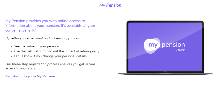
Best practice: Encourage self-service. Whenever you can redirect your members to the secure member area, tell them why it is best for them.
Describe the benefits of the secure member area first and focus on the process or other channels later.
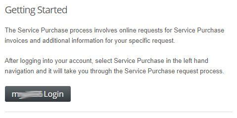
Practice to avoid: Avoid legalese. Tell your member in simple terms why they should log in to the secure area. If a member has to invest effort to understand the benefit or the process, they will be inclined to call a service agent.
Emphasize the secure member area so it stands out in your navigation menu.
Idea: Color catches the visitor's eye when you use a light website design. Color can then be used highlight key options, like the secure member area. Use colors judiciously if you want to be effective.
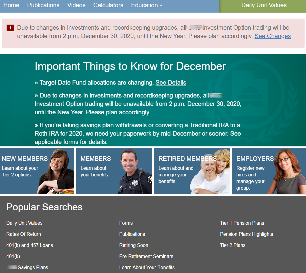
Dark web designs negatively impact readability and make it difficult to highlight key actions.
Practices to avoid: Small, light font on a dark background is difficult to read.
Graphics should be used sparingly in the body of your website to highlight key options.
Best practice: Most websites opt to use light color schemes with a lot of white space to improve readability. Graphics can be used to highlight the most important actions.
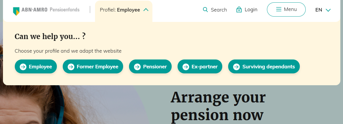
One plan uses a pop-up in their navigation menu to prompt members to identify themselves so they can personalize the website for them.
Idea: ABN Amro Pensioenfonds encourages visitors to identify who they are via a pop-up, so they can personalize the homepage. The pop-up shows up once and the visitor's choice is remembered for future visits.
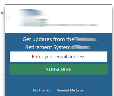
Pop ups can be annoying and divert the member's attention from what matters.
Practices to avoid: On this plan's website, a pop up appears on the bottom-right of the screen asking members to subscribe to a newsletter. Is getting a fraction of members to subscribe worth the annoyance?
Flashing or scrolling graphics continuously distract the visitor from what they are doing.
Practices to avoid: Scrolling graphics distract. These are commonly found below the navigation menu on member home pages. Information that is not necessarily relevant for the member is emphasized.
Use black font on a white background and ample white space for your main text. It is easiest to read.
Best practice: The best websites do not overwhelm their readers with dense or colorful text. People are used to scrolling. You have ample vertical space to tell a story cleanly.
Dense text on busy pages is hard to read.
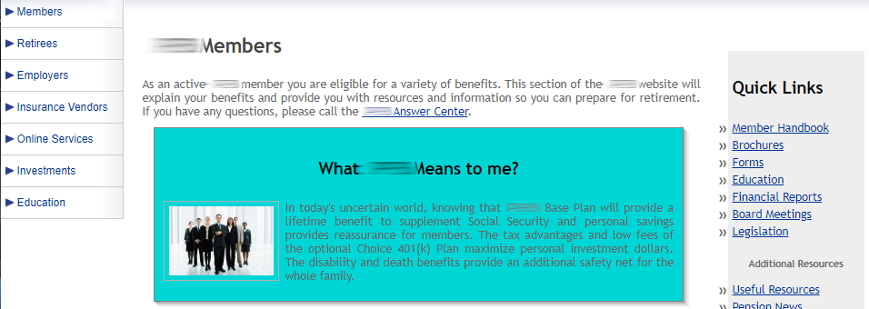
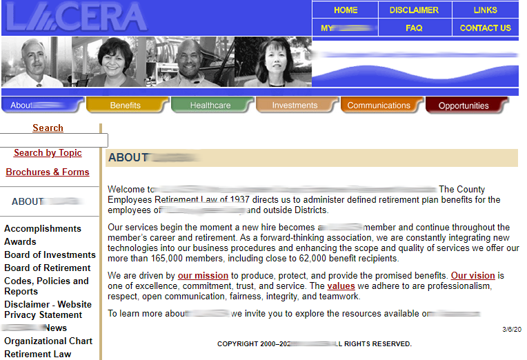
Practice to avoid: Small fonts, little white space, color and additional side menus make the text in the example below hard to read.
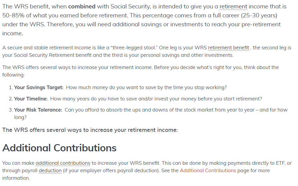
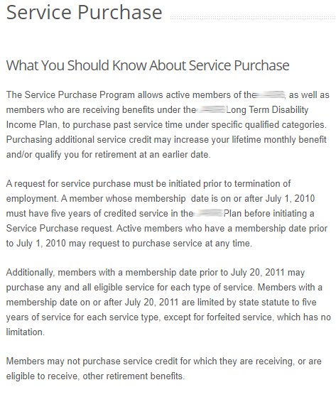
Avoid legalese. Focus on the benefit first and address the complexities later.
Practice to avoid: The reader has to invest considerable effort to understand the text below. The language is technical and hard to follow. The member is being put to work.
Avoid using system-focused menu headers and industry jargon.
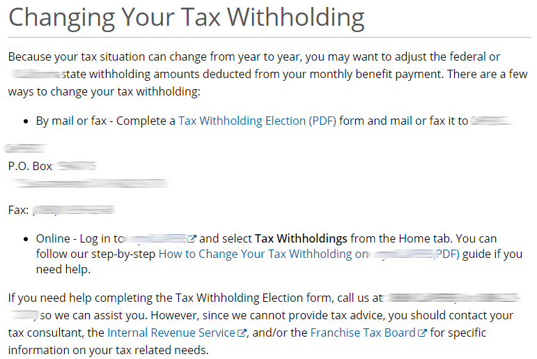
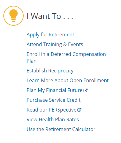
Practice to avoid: Avoid organizing around the things you do and offer. For example, the "I Want To" section below includes a seemingly random list of things the organization offers including retirement, training and the newsletter. It is better to organize around member life events and objectives.
Great navigation menus help members find the information they need quickly and easily.
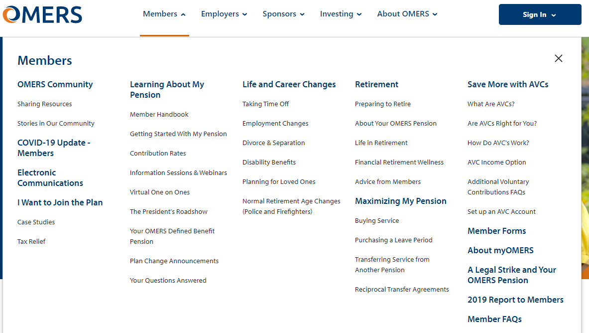
Best practice: Most leading plans opt for expandable mega menus. These menus are an excellent design choice. The entire website, including lower-level site pages, are logically organized, visible at a glance and one click away. OMERS' menu looks clean, uses clear headers, avoids pension jargon (where possible) and includes a life and career changes section.
The best navigation menus still highlight the options that are most relevant to the member.
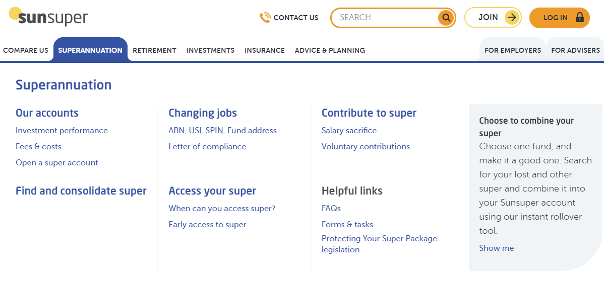
Best practice: The navigation menu below highlights key options in orange: "Contact us", "Search" and "Log in". Two menus are de-emphasized, because they are not relevant for members (e.g., "For employers" and "For advisers").
NB: The Australian Defined Contribution, or superannuation, industry is a great source for inspiration for member experience best practices. These plans beat other financial service providers to win national customer experience and service innovation awards.
Poorly organized navigation methods confuse and frustrate members.
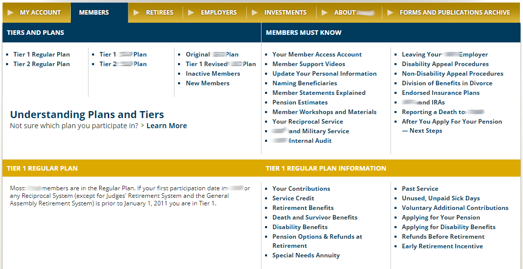
Practice to avoid: Mega menus are superior to dropdown menus, because they allow you to logically categorize options. The mega menu below has two broad categories, 'Tiers and plans' and 'Members must know', but the bulleted items are two continuous lists separated by 4 vertical dividers. The options are applicable to all members, but could be subcategorized in a more meaningful way - a missed opportunity. Language can be improved to make the options clearer for the member.
The entire site should have a consistent, modern feel. For members, your website is a reflection of your business.
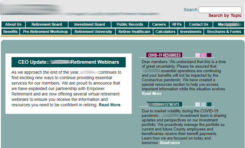
Practices to avoid: Inconsistent formatting and navigation forces members to re-orient themselves on each page. In the example below, the plan's navigation menu changes from buttons to tabs and the color scheme changes too.
Visual, structural and textual clarity are critical for a member-friendly mobile website.
Idea: Your members will visit your website on their mobile devices. Your mobile site is a great starting point for website design. Mobile designs introduce limitations on screen size and force you to prioritize what content is most important to the member.
Ten easy ways to improve the clarity of your website.
Identify a member-centric goal and starting point for your website. Don't overcomplicate the goal. Simplicity makes life easier for your member.
Sell the benefits of the secure member area. This is where the member can receive the best service, but they must be encouraged to log in.
Ensure the right headings and buttons stand out throughout your website. Use graphics and colors judiciously to highlight key actions. These effects catch the visitor's eye.
Use black font on white background for main text. Colored fonts are difficult to read.
Explain things succinctly and add more white space. People are used to scrolling. You have ample vertical space to tell a story cleanly.
Avoid legalese. Information on your website has to be easy to read and find for your members.
Your navigation menus should be organized in an intuitive way. Use descriptive menu names and headings.
Emphasize the secure member area, search box and contact menu at the top of your website. Make it easy for regular users to find resources quickly.
Ensure your website has a consistent theme. Try not to lead your members off-site.
Don't forget your mobile website. Visual, structural and textual clarity are critical for a member-friendly mobile website.
How to access the rest of CEM’s public website review?
The rest of our public website review can be accessed via the links below:
Do you have a specific question for your peers? Join the discussion on CEM's Peer Intelligence Network (PIN).
Copyright 2021 © CEM Benchmarking Inc. All Rights Reserved


